This project is based on Season 3, Episode 2 of the Kaggle Playground Series. The title of this episode is: “Tabular Classification with a Stroke Prediction Dataset”. Our task is to predict the probability that a patient will have a stroke.
The target, stroke, is a binary variable and so classification methods are needed to predict the probability of stroke. In this project, I will be training the data on an ensemble of machine learning models.
The models I use (and their associated Python libraries) are:
Random forest (from sklearn.ensemble import RandomForestClassifier)
Support vector machines (from sklearn.svm import SVC)
However, instead of building the ensemble by just averaging the results of the predictions from these models, I will instead use a method called Super Learner Ensembling. This method uses cross-validation and combines the results through a final meta learner. In this project, I use logistic regression as the meta-learner and the package ML-Ensemble (which simplifies the process considerably).
Check out a previous blog post to find out more about the different ensemble methods you can use.
Stroke Data Description
The dataset I will use in this project was synthetically generated from the original stroke dataset. This allows us to use real-world data while not compromising privacy in any way. However, we will combine some parts of the original stroke dataset to enrich our analysis.
This stroke dataset contains the following features:
id: unique identifier
gender: “male”, “female”, or “other” (categorical)
age: age (in years)
hypertension: whether or not the patient has hypertension (binary)
heart_disease: whether or not the patient has heart disease (binary)
ever_married: whether or not the patient was ever married (binary)
In this phase of the project, I want to identify any potential ‘funnies’ in the data that may require cleaning and create any visualizations that may be useful for the model-building stage.
Using df.describe() prints out some quick summary statistics of the dataset. However, by using the exclude parameter, you can ignore columns of a certain type (don’t know how I only just discovered this).
A first look at this table shows two obvious problems:
Minimum age is 0.08 – unless the study included newborns, this is probably dirty data.
Minimum BMI is 10.30 – this is an unrealistic value for a person so this is probably also dirty data.
Dirty data like this can be removed or imputed as if they were nulls. In this project, they didn’t make much of a difference to the modeling so I left those data points in the data.
Next, I want to have a look at the distribution of the target variable, stroke. Quickly printing the counts reveals a very unbalanced dataset with only 632 cases out of over 15k data points!
A post on the discussion forum for this dataset suggests adding valid cases from the original dataset to this dataset for training. There are 249 cases in that dataset, of which 40 BMI values are null. Taking complete cases leaves 209 additional cases that can be included in our model here.
Visualizing the target variable (after adding the additional cases):
Next, I print out a few quick counts of the categorical variables in the dataset.
Gender
Count
Male
5857
Female
9446
Other
1
Residence Type
Count
Rural
7763
Urban
7749
Ever Married
Count
No
4941
Yes
10571
Work Type
Count
Govt job
1561
Never worked
42
Private
9879
Self-employed
1992
Children
2038
These counts reveal two issues:
Gender has an ‘other’ category. Since there is only 1 data point with this category, I will simplify things by replacing it with ‘Female’ – the dominant gender category. Thereafter, the gender variable can be converted to a 0/1 binary variable.
Residence type and ever married should be converted to 0/1 binary variables. It is possible to do one hot encoding for these variables but it would unnecessarily increase the dimensionality of the data and can hurt the performance of the model.
Fitting the Model(s)
To predict whether or not a patient will have a stroke, I fit an ensemble of 8 classification models using the ‘Super Learner’ ensemble method.
To prepare the data for the model, the continuous variables are standardized and the categorical variables are one hot encoded. I also drop the ID column since it doesn’t help the model in any way.
To fit the ensemble, we must first define the list of models that will be used in the ensemble.
# Get a list of models
def get_models():
models = list()
models.append(LogisticRegression())
models.append(DecisionTreeClassifier())
models.append(xgb.XGBClassifier())
models.append(lgb.LGBMClassifier())
models.append(AdaBoostClassifier())
models.append(KNeighborsClassifier())
models.append(RandomForestClassifier())
models.append(SVC(probability=True))
return models
Then, using ML-Ensemble, we must add one layer for these models and then a second meta-layer for the predictions.
def build_ensemble():
ensemble = SuperLearner(random_state=seed, folds = 25, shuffle = True, verbose = 1)
# Add models
models = get_models()
ensemble.add(models, proba = True)
# Attach the final meta estimator
ensemble.add(LogisticRegression(), meta = True, proba = True)
return ensemble
An important point to note is that this Kaggle competition required the predicted probabilities and not the predicted classes. Since ML-Ensemble prints the classes by default, we need to specify proba = True in BOTH layers (this was not documented very well so I spent way too much time figuring out how to get predicted probabilities here!).
Using this function, we can build the super learner:
# Build the super learner
ensemble = build_ensemble()
And finally, the ensemble is fitted to the training data (here, we must use df.values because the ML-Ensemble package does not accept a dataframe):
# Fit the super learner ensemble
ensemble.fit(train_features_scaled.values, train_target.values)
The final score I got for this submission was 0.89285. I could have improved this with some fine-tuning, but I stopped here for this project.
I hope you found this helpful! You can find the full code on Github.
If you have any questions or comments, drop them below! I’d love to hear from you!
This project is based on Season 3, Episode 1 of the Kaggle Playground Series. The title of this episode is: “Tabular Regression with the California Housing Dataset”. Our task is to predict the median housing value of a block group of housing.
In this project, my goal is to use the Julia programming language for the first time in a machine learning application. I will be using the Julia package Pluto as my notebook environment for the project. I like to think of Pluto notebooks as upgrades of Jupyter notebooks since they have many additional features that Jupyter lacks (such as reactivity).
The target variable, median housing value, is a continuous variable and so regression techniques are needed. To keep things simple as I learn to use Julia, I will be applying linear regression only.
Let’s get started.
California Housing Data Description
The dataset I will be using here was synthetically generated from the original California Housing dataset. This allows us to use real-world data while not compromising privacy in any way.
As previously mentioned, the target variable is MedHousVal – median housing value. The features of the dataset are:
MedInc – median income in block
HouseAge – median house age in block
AveRooms – average number of rooms per house
AveBedrms – average number of bedrooms per house
Population – population of block
AveOccup – average number of household members per house
Lattitude – latitude of block
Longitude – longitude of block
Setting up a Julia Environment
Pluto notebooks also serve as their own environments. Each Pluto notebook automatically stores information on the packages used, their dependencies, and their corresponding versions. However, I wanted to store this information about my environment separately so that I can share my code with anyone that uses Julia, without them needing to specifically use Pluto too.
Julia has built-in package and environment management through a package called Pkg. Once you start a Julia session in your terminal you simply type the right square bracket ] and you will enter ‘package mode’ where you can activate an environment and add, remove, or update packages.
If you navigated to the directory of your project in your terminal, you can simply type activate . and the current directory becomes the environment.
To switch off Pluto’s automatic package management, we must activate the project environment from inside Pluto using this code:
begin
import Pkg
# Activate the environment at the current working directory
Pkg.activate(Base.current_project())
# Instantiate to prevent missing dependencies
Pkg.instantiate
# Specify the packages we will be using in this project
using StatsKit, MLJ, Gadfly, Random, MLBase
import Plots
end
So, I will be using the following packages for this project:
StatsKit – collection of essential stats packages
MLJ – machine learning toolkit
Gadfly – data visualization (similar to GGPlot2 on R)
Random – random number generator for setting the seed
MLBase – basic machine learning functionality
Plots – Plots is imported only so that I can plot a correlation heat map
Data Exploration
During the data exploration phase, I’m looking for any issues that may need to be addressed (like missing values or extreme outliers) and visualizing the data.
A first inspection of the data doesn’t reveal any obvious issues, and I don’t notice anything special that warrants further investigation.
I decided to create an additional variable called ‘BlockDensity’. This uses the total population and average number of occupants per block to indicate how many houses are located in a block. The hypothesis was that dense blocks could either indicate smaller houses that cost less or it could indicate tall apartment buildings that cost more.
# Number of houses in a block (ie. block density)
mod_df.BlockDensity = mod_df.Population ./ mod_df.AveOccup
The main visualization that I look at is the correlation heat map to get an idea of how correlated the target is with the features (and the features with each other).
begin
cols = names(mod_df)
corr_matrix = cor(Matrix(mod_df))
# PLOT
(n,m) = size(corr_matrix)
Plots.heatmap(corr_matrix, xticks=(1:m,cols), xrot=90, yticks=(1:m,cols), yflip=true, c = :bluesreds)
Plots.annotate!([(j, i, (round(corr_matrix[i,j],digits=1), 8,"Computer Modern",:white)) for i in 1:n for j in 1:m])
end
This quickly reveals a strong positive correlation between the target (median house value) and median income. This makes sense since people with higher incomes can generally afford more expensive houses.
Since I’ll will be using linear regression for this project, I need to deal with outliers as they can skew the results. For this reason, I wrote a function that finds outliers based on a method by Tukey called the outer fences.
These formulas allow us to identify data points that are far out from the first and third quartiles.
# Finding outliers past the outer fences
# (Q1 - (3*IQR); Q3 + (3*IQR))
function outer_fences(df, X)
print("\n $(X)")
# Quantiles
quantiles = quantile!(df[!, X], [0.25, 0.75])
q1 = quantiles[1]
q3 = quantiles[2]
# Interquartile range
IQR = q3-q1
# Fences
fence_1 = q1 - (3*IQR)
fence_2 = q3 + (3*IQR)
print("\n Fence cutoffs: ($(round(fence_1, digits=2)), $(round(fence_2,digits=2)))")
# Count the number of samples that are outside the fences
outside_samples = df[!, X][(df[!, X] .< fence_1) .| (df[!, X] .> fence_2), :]
count_outside_samples = size(outside_samples)[1]
print("\n Number of outside samples: $(count_outside_samples)")
return X, fence_1, fence_2
end
I probably spent far too much time on this problem of outliers than I should have, but I was able to identify and remove around 1625 data points from the training data.
Fitting the Model
To fit a linear regression model I used the lm function from the GLM package. The only downside to this function is that you must specify every feature in the formula for the regression equation, which was a bit of a pain.
The R2 value for this model looked promising but the RMSE was a little too high. Printing the R2 value was straightforward:
# R Square value of the model (0.9194)
r2(linearRegressor)
However, getting the RMSE took a bit more effort. First, I define the RMSE function definition:
# RMSE function definition
function rmse(performance_df)
rmse = sqrt(mean(performance_df.error.*performance_df.error))
return rmse
end
Then a dataframe is created with the predicted and error values for the training and test sets which can then be entered into the RMSE formula. The RMSE for the test set is 0.3147 and is 0.3111 for the train set.
Overall, this was a good learning experience using Julia for the first time. Some aspects of the Julia language seemed unnecessarily complicated and required additional function definitions or steps. However, on the other hand, there were many other aspects of Julia that made it a pleasure to work with (such as the extremely simple environment management).
Check out the associated Github repo for the full code.
Voting ensembles combine diverse machine learning models using techniques like majority voting or average predictions. The individual models used in the ensemble could be regression or classification-based algorithms. Once the individual models have been trained, the ensemble can be constructed in a couple of different ways.
In regression, ensembles are created by averaging the (weighted or unweighted) predictions. In classification, ensembles are created through majority voting (also called hard voting) of predicted classes or through (weighted or unweighted) average predicted probabilities (also called soft voting).
Voting ensembles can be easily applied in python using these classes in the Sklearn library:
VotingClassifier
VotingRegressor
These classes can also be combined with grid search and cross-validation to tune the hyperparameters in the models such as choosing between hard and soft voting or choosing the best weights.
Bagging Ensembles
Bagging ensembles are created from several instances of a single algorithm that are each trained on different subsets of the training data.
There are a few methods that fall under the category of bagging ensembles, and they differ only in the way that the subsets are chosen:
When subsets are formed by sampling the observations with replacement, the method is called bagging (short for bootstrap aggregation).
When subsets are formed by sampling the observations without replacement, the method is called pasting (not short for anything).
When subsets are formed by sampling a set of features only, then the method is called random subspaces.
When subsets are formed by sampling both the features and observations, then the method is called random patches.
The final ensemble is built by aggregating the individual predictions made for each sample of observations. This aggregation is performed either by majority voting or by (unweighted or weighted) averaging.
When bagging is performed on decision trees, this is a special form of ensembling known as Random Forests and contains many unique, complex features compared to other algorithms.
Bagging can be implemented in python with these Sklearn classes:
BaggingClassifier
BaggingRegressor
Plus also, RandomForestClassifier and RandomForestRegressor
Boosting Ensembles
Boosting ensembles are formed by incrementally combining a set of weak learners into a single strong learner. The term ‘weak learner’ here represents a model that may only be slightly better than taking a random guess at the prediction. In the case of regression, this guess is made by simply using the mean value of the target variable.
In contrast to bagging, each weak learner is trained on the entire dataset, and no sampling takes place. However, in boosting, each observation in the training data is assigned a weight based on the ability of the algorithm to predict it accurately.
Since ensembles are constructed sequentially, boosting can be very slow and computationally expensive.
There are many implementations for boosting ensembles. Some have become very popular and are the default methods for applying boosting. These are five of the most common boosting implementations used today, as well as their associated python libraries:
AdaBoost (AdaBoostClassifier and AdaBoostRegressor from Sklearn)
(Standard) Gradient boosting (GradientBostingClassifier and GradientBoostingRegressor from Sklearn)
Histogram-based gradient boosting (HistGradientBoostingClassifier and HistGradientBoostingRegressor from Sklearn)
Stacking is short for stacked generalization, and it involves a different approach for aggregating the predictions made by the individual models in the ensemble. Instead of averaging or finding the majority vote of a prediction, stacking uses a machine learning model to select the best way to combine the predictions.
Stacking can be applied using python and Sklearn and these libraries:
StackingClassifier
StackingRegressor
A special application of stacking is Super Learner Ensembling. This method applies k-fold cross-validation and builds an ensemble from the out-of-fold predictions from each model.
Super learner ensembles can be implemented in python using Sklearn. Alternatively, there is a library called ML-Ensemble (also called mlens) that builds on Sklearn to simplify the process.
Implicit & Explicit Ensembles
Implicit and explicit ensembles are actually single models that are trained in such a way that it behaves like an ensemble of multiple neural networks. This allows ensembles to be built without the additional training costs involved in training multiple models.
Implicit ensembles share their model parameters, and the averaging of the ensemble models is done at test time with a single unthinned network. Some implicit ensemble models are:
DropConnect
Dropout
Stochastic depth
Swapout (hybrid of dropout and stochastic depth)
Dropout as a bayesian approximation
Explicit ensembles do not share their model parameters and would produce an ensemble model through standard approaches like majority voting or averaging. Some explicit ensemble models are:
Snapshot ensembling
Random vector functional link networks
Consensus Clustering
Clustering is an unsupervised machine learning technique that is used to group similar observations together. Ensemble techniques are used in clustering to combine several weak clusters into a strong one. However, each weak cluster must be as different from each other as possible in order for the ensemble to be a significant improvement.
There are a few approaches that can be used to create clusters that differ:
Using different sampling data
Using different subsets of features
Using different clustering methods
Adding random noise to the models
This technique gains a consensus on the assigned cluster of an observation based on a combination of all other iterations of the clustering algorithm in the ensemble. Clustering ensembles are made up of (1) the generation mechanism and (2) the consensus function. The generation mechanism is simply the set of iterations of the clustering algorithm that will be combined to form the ensemble. The consensus function defines the way that the ensemble will reach a consensus on the clusters. The biggest challenge in clustering ensembles is to produce a combined ensemble (through the consensus function) that improves the result over any single clustering algorithm.
There are 2 primary consensus function approaches:
Objects co-occurrence: this uses a voting process to assign clusters
Median partition: this finds clusters through an optimization problem that finds the median partition with respect to the cluster ensemble. The median partition can be thought of as the partition that best summarises the results of all models in the ensemble.
Consensus clustering can be implemented in python using the Cluster Ensembles library. However, some of the more niche implementations of consensus clustering may need to be done from scratch in python as there doesn’t seem to be a lot of support out there for them yet.
I hope this blog post gave you a good high-level overview of some of the common ensemble methods available today. Look out for future blog posts where I dive into some of these methods with detailed descriptions and practical applications in python.
If you have any questions, feel free to reach out on Twitter or leave a comment below!
In this post, we’ll be learning about decision trees, how they work and what the benefits are for using them. We’ll also use this algorithm in a real-world data to predict diabetes.
So, what are decision trees? Decision trees are a machine learning method for classification or regression. It works by segmenting the dataset through if-else control statements applied to the features.
There are few algorithms that can be used to implement decision trees and you may have heard of some of them. The most popular algorithms are ID3, C4.5 and CART. However, the Scikit-learn python library only supports the CART algorithm which stands for Classification and Regression Trees. This article is entirely based on the CART algorithm.
Benefits of Decision Trees
Decision trees are known as ‘white box’ models which means that you can easily find and interpret their decisions. This is in contrast to ‘black box’ neural networks where it is extremely difficult to figure out exactly how final predictions were made. Fortunately, decision tree models are easy to explain in simple terms, along with why and how the predictions were made by the model. Since decision trees are just if-else control statements at heart, you can even apply their rules and make predictions by hand.
Decision trees can be easily visualised in a tree-like plot that makes it even easier to understand and interpret the model. Have a look at this simplified decision tree below based on the data we’ll be analysing later on in this article. We can actually take a single data point and trace the path it would take to reach the final prediction for it.
Decision Tree Simple Model Visualisation
The Scikit-learn python library together with the CART algorithm supports binary, categorical, and numerical target variables. However, for the feature variables, only binary and numerical features are supported at this time. This means that each node in the decision tree can only have up to 2 branches leading out the node and so features must either be true or false.
The good news is that decision trees require very little data preparation and so you don’t need to worry about centering or normalising the numerical features first. Having said that, there are still a couple of best practices to follow when fitting a decision tree to your data and we’ll chat about them a bit more towards the end of this article.
It’s also good to keep in mind that decision trees are pretty sensitive to even small changes in the data and tend to learn the data like a parrot. This means that it is easy for the model to overfit to the data and can even be biased if the target variable classes are unbalanced. For this reason, decision trees must be closely controlled and optimised to prevent these problems (also more on this later).
How Does it Work?
Without getting all technical, let’s go over how the decision tree CART algorithm works. The main goal is to divide the data into distinct regions and to then make predictions based on those regions.
Starting at the top of the tree, the first question the algorithm must answer is “which feature should be chosen at the root?” To answer this question, the algorithm needs a way of evaluating each feature and choosing the ‘best’ feature to start with. Thereafter, the algorithm needs to keep asking a similar question at each node: “which feature should be used to split this node?” It does this by calculating and optimising a metric against each of the available features.
There are a couple of metrics that can be used depending on the problem at hand. For example, if we’re dealing with a regression problem then we can seek to find the feature with the lowest RSS (residual sum of squares). However, if we have a classification problem then we can choose the feature with the lowest entropy (or highest information gain) or the lowest gini impurity.
If you’re wondering whether to choose entropy or gini impurity for classification problems, don’t waste too much time on it as there isn’t a hell of a lot of difference between the resulting decision trees. So toss a (balanced) coin and pick one.
Sklearn uses the gini impurity by default so we’ll briefly go over this metric. The gini impurity is a metric that measures the purity of a node. That is, it measures how similar the observations are to each other. If all observations belong to the same class then the gini impurity would be 0 and the node would be considered ‘pure’.
The decision tree algorithm is in constant pursuit of pure nodes and it will continue to split the data into deeper and deeper trees until it finally reaches pure leaf nodes (or it runs out of data or features). In addition, the data is split in a greedy fashion using recursive binary splitting. It’s called greedy because the algorithm will make a split based on what is optimal for the step it is currently dealing with and will not choose a split that can result in a more optimal tree further down the line. This also means there are no backsies – the algorithm won’t backtrack and change its mind for a previous split.
We mentioned ‘leaf’ nodes. These are nodes that do not get any further splits and any observation that takes a route to a leaf node will get the resulting predicted class. At each leaf node, the class that has more than 50% of its samples belonging to it will serve as the prediction for that node. For classes with a tie, the non-event class is automatically chosen.
Predicting Diabetes with Decision Trees in Python
The data in this project contains biographical and medical information that is used to predict whether or not a patient has diabetes. You can find the data on Kaggle.
These are the goals for this project:
Explore the data – determine if it requires any cleaning and if there are any correlations in the data
Apply the decision tree classification algorithm (using sklearn)
Visualise the decision tree
Evaluate the accuracy of the model
Optimise the model to improve accuracy
Setup
import numpy as np
import pandas as pd
from sklearn import tree
from sklearn.model_selection import train_test_split
from sklearn import metrics
import graphviz
import matplotlib.pyplot as plt
import seaborn as sns
sns.set()
custom_params = {"axes.spines.right": False, "axes.spines.top": False}
sns.set_theme(style="ticks", rc=custom_params)
sns.set_palette(sns.dark_palette("seagreen", reverse=True))
Explore
These are the feature variables in our data:
Number of pregnancies
Glucose
Blood pressure
Skin thickness
Insulin
BMI
Diabetes Pedigree Function
Age
The most confusing feature here is the diabetes pedigree function. To understand it, I read the recommended research paper for this dataset and made these notes:
The criteria for a diabetes diagnosis is if the ‘2 hour post-load plasma glucose was at least 200 mg/dl’.
This dataset specifically contains women over the age of 21.
The Diabetes Pedigree Function provides ‘a synthesis of the diabetes mellitus history in relatives and the genetic relationship of these relatives to the subject’. In other words, this score is higher if there is a family history of diabetes and it’s lower if not.
To start our data exploration, let’s have a look at some summary statistics of our data:
These are a few points we can note about the data:
All our features are numerical
We have a total sample size of 768
There are no missing values to deal with right now
A few features have a minimum value of 0 which is suspicious for (living) humans:
Min glucose = 0
Min blood pressure = 0
Min skin thickness = 0
Min insulin = 0
Min BMI = 0
To clean this up, we will convert these zeros to nulls and remove them from our dataset. This takes our dataset down from 768 to 392 (that was painful!).
Next, let’s have a look at a correlation matrix between all the variables in our data.
The outcome is positively correlated with all features which is a good sign for modelling
The outcome is most strongly correlated with Glucose (which makes sense since this is about Diabetes) and then Age
There is a strong correlation between Age and Pregnancies – older women = more pregnancies?
Insulin and Glucose are correlated – higher insulin = higher glucose?
SkinThickness and BMI are correlated – higher BMI = higher skin thickness?
An additional note to make is that decision trees tend to be sensitive to unbalanced classes. So, we’re also going to take note of how many observations fall into each outcome class from the original dataset:
Not Diabetes
Diabetes
500
268
From this table, we can see that the outcome classes are unbalanced – there are twice as many non-events as there are events. This could make it difficult for the model to correctly predict when someone has diabetes. We may need to balance out the classes during the optimisation phase to see if it improves the accuracy of the model.
Model
The is the modelling process we’ll follow to fit a decision tree model to the data:
Separate the features and target into 2 separate dataframes
Split the data into training and testing sets (80/20) – using train_test_split from sklearn
Apply the decision tree classifier – using DecisionTreeClassifier from sklearn
Predict the target for the test set
Evaluate model accuracy – using metrics from sklearn
Visualise the decision trees – using graphviz
Optimise the decision tree – using various parameters such as max_depth, min_samples_split, etc.
# Separate features and target
target = df_reduced["Outcome"]
features = df_reduced.drop("Outcome", axis = 1)
# Split into train and test sets
features_train, features_test, target_train, target_test = train_test_split(features, target, test_size = 0.2, random_state = 42)
# Fit the decision tree model
decisiontree = tree.DecisionTreeClassifier(random_state = 42)
decisiontree = decisiontree.fit(features_train, target_train)
# Predict the target for the test set
target_pred = decisiontree.predict(features_test)
This fit gives an accuracy score of 72.15%. Not too bad, but I’m sure we can improve it.
Visualising this tree, we can see it is a bit of a mess. Some nodes have just 1 sample in them and since we don’t have much data we will need to control the number of samples in each node and also the max depth as this can lead to overfitting and poor performance on unseen data.
Optimise
We’ll try a couple of strategies to optimise this model:
max_depth = 3, min_samples_leaf = 2 — this produced an accuracy of 74.68%
max_depth = 4, min_samples_leaf = 2 — this produced as accuracy of 73.42%
max_depth = 5, min_samples_leaf = 2 — this produced an accuracy of 75.95%
Increasing the depth any further results in declining performance. A max depth of 5 gave the highest accuracy.
Next, we will balance the dataset by randomly selecting only 130 rows from a total of 262 where the outcome = 0 (ie. class = Not Diabetic). Balancing the dataset produces an accuracy of 78.85%, in addition to setting max_depth = 5 and min_samples_leaf = 2.
Looks like we’ve found a winner 🙂
Here is a visualisation of this optimised tree:
I hope you found this post helpful. If you have any questions don’t hesitate to drop a comment or reach out to me on Twitter!
In this first project of 2022, I will be fitting linear and polynomial regression models to some randomly generated dataset where there is a nonlinear relationship between the target and the predictor.
The purpose of this project is to observe some of the red flags for a model that is severely underfitting to the data and how these red flags change when fitting a more appropriate model.
The red flags that I’ll be considering are:
MSE and R-squared – these are common performance metrics used in linear models.
Residual plot – this plot will show us if some of the assumptions of linear regression have been violated.
Learning curves – this plot will show us how well the model fits to the data and usually gives a good indication of over/under fitting.
Generating the data
I generate the data using a polynomial equation of degree 2:
# Generate some nonlinear data
m = 500
X = 9 * np.random.rand(m, 1) - 1
Y = 0.5 * X**2 - 3 * X + 7 + np.random.randn(m, 1)
In this visualisation of the data, we can clearly see the nonlinear relationship that we have generated from the above equation:
Linear Regression
Being one of the oldest and simplest models, linear regression is pretty well known and easy to understand. In this project, I am using linear regression to demonstrate what underfitting looks like and as a comparison to polynomial regression.
To fit linear regression, the response variable must be continuous. There are also a couple of assumptions that must be satisfied in order to use linear regression with some degree of accuracy, otherwise the results can be misleading or downright incorrect.
Linearity: the relationship between the response variable and the predictors must be linear.
Homoscedasticity: the variance of the residuals must be constant. So, as the value of the predictor increases, the variability in the response stays the same.
Independence: the residuals must be independent of one another. This means that each observation must not be determined by or correlated with another. Usually only an issue in time series data.
Normality: the residuals are normally distributed. In other words, the average of all residual values is zero.
These assumptions are usually overlooked when linear regression is applied but they are very important. In this project, The assumptions of linearity and normality are both purposely violated to support the decision to use polynomial regression.
Below is the linear regression model fitted to the generated dataset:
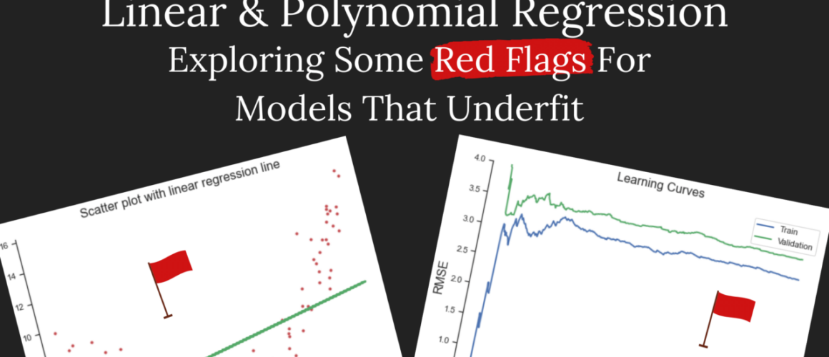
This model gives a Mean Square Error (MSE) score of 10.0 and an R-Squared (R2) score of 0.27. Both these scores give our first red flags. Ideally, MSE should be as low as possible (around 1 is very good) and R-squared should be as close to 1 as possible. So far, our model is not doing a good job of describing the data.
Let’s plot the residuals versus the fitted values – this gives a good indication of whether the assumptions of linearity and normality are violated. Ideally, there should be a random scatter of points around 0 with no discernible pattern or shape in the data. The below plot shows a definite nonlinear pattern in the data:
Next is the learning curves. To generate this plot, multiple models are fitted to varying dataset sizes and the Root Mean Square Error (RMSE) is recorded. In this plot, we get to compare the training performance against some predictions made on a validation set.
As before, we want the RMSE to be as low as possible. But now, we also want the training and validation errors to be as close as possible as the training set size increases. If the validation error is higher than the training error then we know that the model did not generalise well to new data and this is a red flag for over/under fitting.
In these learning curves for linear regression, not only is the RMSE high, but the validation error remains higher than the training error throughout the process.
Great, so now that we know that that above model is a total mess and does a really bad job at making predictions, let’s make a better choice.
Polynomial Regression
When the assumptions of linear regression are not satisfied and the model isn’t capturing the relationship between the response and the predictors then we need a different approach.
Polynomial regression lets us model a non-linear relationship between the response and the predictors. It is a natural extension of linear regression and works by including polynomial forms of the predictors at the degree of our choosing.
Here, we get a wonderful MSE score of 1.0 and an even better R-squared score of 0.9. Plotting the new polynomial regression line to our data we see that it fits like a glove:
Plotting residuals versus fitted values again we now see that there is a nice random scatter of points around 0 and I can’t make out any patterns, so that’s good!
Lastly, the learning curves. Both the validation and training errors hover at around 1.00 and although the lines do not meet in this plot, if I added more data, they would eventually converge.
I hope this project gave you some insight into the red flags commonly seen for linear models that underfit. Reach out to me on Twitter if you have any feedback or questions.
You can find the full code for this project on GitHub.
You don’t need a fancy PC to get started with data science and machine learning. In fact, you can run all your code in cloud-based notebooks without even worrying about setting up an environment locally.
Even if you’re new to data science, you’ve probably heard of Jupyter Notebooks. It has become the number 1 way to do data science. Jupyter Notebooks make it so much easier to run your code, write commentary and see your output all in 1 place. Almost all cloud platforms use some kind of Jupyter-like environment.
In this blog post I am going to share 5 ways you can do data science in the cloud. Each of these platforms allow you to do this completely for free and they each work really well.
In my opinion, the 2 biggest upsides of using cloud platforms for data science are:
Speed of set up – You can get set up in just a few minutes and have almost everything you need to do machine learning available to you. You don’t need to go through the hassle of setting up an environment locally before you start writing code and analysing data.
Collaboration – Being able to share your work and collaborate on projects is a big upside of any kind of cloud platform. However, collaboration is not available for all the platforms listed here. Even when it is offered, the degree of collaboration differs from platform to platform.
5 platforms will be covered in this post:
Datacamp Workspaces
Kaggle Notebooks
Google Colab
Deepnote
Datalore by JetBrains
Gradient Notebooks
There are a few things you should note about how I have judged these platforms. I have actually tried each of these platforms myself and am giving my own opinions on what I think of them. My primary use of cloud platforms is to work on personal projects and not for company or enterprise use.
These are the criteria that I am using to compare these platforms:
Price – they should be free or at least offer a decent free plan (not just a trial)
Speed of set-up and low admin – I shouldn’t have to ‘babysit’ my projects in case I go over ‘allowed hours’. I’d like to be able to log on, work on a project and log off without worrying about whether I shut the server down.
Aesthetic and intuitive – the app should look good and it should be intuitive and easy to use
Collaboration – I’d like to be able to share my work with friends and be able to collaborate on them live. I’d also like to have the option to share securely if I want to, without my project being available publicly.
Great, now that I’ve cleared all that up, lets get into it.
DataCamp Workspaces
DataCamp recently launched their Workspaces feature that allows you to run code in a Jupyter-like environment. There is currently no collaboration feature but it is something they are working on. Right now, you can just share your notebooks with other people and they are able to view them and add comments.
DataCamp’s philosophy with the initial launch of Workspaces is that they want it to be as easy to do data science as it is to learn it. They have already created an incredible interactive environment for learning data science and Workspaces seem like a natural next step for anyone who now wants to easily apply their skills and start putting together a portfolio.
The Workspaces are completely free and you can choose between R or Python. So far, their notebook editor looks good and it is intuitive to use. There is also no admin involved in running or maintaining the workspace which makes it hassle-free.
Kaggle Notebooks
To me, Kaggle is like the OG of cloud-based data science platforms, having started way back in 2010. Initially, they started out as a machine learning competition platform. Since then they have expanded and now offer ways of sharing datasets, notebooks and have a huge community in their forums where you can ask questions and get help.
Kaggle notebooks are free to use, with the option to choose between R and Python and they integrate well with other services. You can even connect your Kaggle notebook to Google Cloud Services to beef up the hardware if you need it, although this will come at an additional cost, of course. Kaggle does provide access to a GPU and for personal projects, it is usually more than enough.
Collaboration on Kaggle notebooks is limited. Similar to DataCamp, you can share your notebooks with other people (such as your teammates in a competition) but you effectively work on different versions of the notebook so there is no live collaboration feature.
Google Colab
Google Colab is another one of Google’s products that operate as a natural extension of Google Drive just like Google Docs or Sheets. If you already use these other products then the Colab UI will feel very familiar.
Naturally, sharing on Colab notebooks is built-in. However, it does not seem to be capable of live collaboration (ie. with 2 or more people editing a notebook together in real-time). I find this to be disappointing since Google basically wrote the book on real-time collaboration with Docs and Sheets.
Colab is also not a particularly pretty app, especially when compared with some of the other platforms I’ll be covering on this list. However, since almost everyone interested in data science most likely has at least 1 google account, setup is by far the fastest.
It is free to use Colab but the resource is not guaranteed and there are several usage limits that change depending on demand. Your usage limits could even be different to mine if your code uses more resources.
Deepnote
Deepnote is by far the most good looking, full-featured platform I have come across. The UI looks great, the editing experience with their notebook is amazing, and they have live collaboration! All of this and it is still free to use (up to a point) plus the platform is still in Beta so you know there is much more to come.

I particularly like their publishing feature – you can publish your notebook as an article or as an interactive app or dashboard. I just love the presentation of the articles and dashboards. Your profile on Deepnote also acts as a portfolio and it is a great viewing experience for anyone looking through your work.
You can get up to 750 hours on their standard machines and each notebook comes with a nifty little feature that automatically shuts the machine down after 15 minutes of inactivity. This keeps the admin pretty low on this platform.
Datalore
Datalore is a platform built by the JetBrains team. The UI looks good and it also comes with live collaboration. There are also a few more options in terms of programming languages with this platform – you can choose between Python, R, Kotlin and Scala.
There is a bit of admin involved with this platform. On the free plan, you get 120 hours/month of basic machine time. However, once you open a notebook, so long as it is an open tab in your browser it will consume resources and eat into your available hours. Because of this, it is important to either close the tab or manually shut down the machine.
Also, if you’ve shared one of your notebooks with someone and they forget to close their browser window down at the end of the day, it’ll eat into your available quota. So that’s something to keep in mind.
Gradient Notebooks
Gradient Notebooks are built by Paperspace. The biggest selling point of Gradient is that they offer free GPU’s. For the free plan, Instead of restricting the number of hours on the platform, the only limits they impose is that you can only ever have 1 notebook running at a time and all notebooks must be public.
Getting set up on the platform and launching a notebook can take a good couple of minutes since all that additional hardware that they offer needs to be provisioned. There is also limited functionality for publishing notebooks and building a portfolio of projects using their platform. They are currently working on a public profile feature, so at least it’s in the roadmap.
Gradient is the platform to go to if you need more resources and more compute for your project and you don’t want to pay a cloud provider like Google Cloud or AWS to get it.
Closing Thoughts
Choosing which cloud platform to use depends on your own goals and needs.
If you’re looking for a place to build a portfolio and get involved in a large community while you’re still learning and improving your data science skills then I’d recommend Kaggle or DataCamp.
If you’re looking for a platform that’s got all the bells and whistles, allows you to build a professionally-looking portfolio and offers real-time collaboration then I’d recommend Deepnote.
If you’ve started branching out into deep learning, NLP, and computer vision then I’d recommend giving Gradient a try.
See this resource for a comprehensive list of almost all available data science notebook platforms.
I hope you found this blog post helpful! Let me know in the comments below what other platforms you’d recommend. I’d love to hear your thoughts!
Stochastic gradient descent is an optimisation technique, and not a machine learning model. It is a method that allow us to efficiently train a machine learning model on large amounts of data. The word ‘descent’ gives the purpose of SGD away – to minimise a cost (or loss) function.
For a better understanding of the underlying principle of GD, let’s consider an example.
A Simplified Example of Gradient Descent
Gradient descent seeks to find the global minimum of a function. To do that, it calculates the gradient at an initial random point and moves to another point in the direction of descending gradient until it reaches a point where the gradient is zero.
As an example, see figure of a parabola below.
The initial random point that starts the algorithm off is at (x = -2, y = 4). The gradient at this point is -3 so the algorithm steps to the right, toward this negative gradient, and calculates the gradient at the next step. Eventually, after a number of steps, the algorithm will reach a point where the gradient is 0 and stops. This is referred to as the global optimum or global minimum.
The learning rate hyperparameter determines the size of each step – too small and the model takes too long, too big and the model may not converge to the global minimum.
Some datasets have an irregular shape and the cost function could contain both local minima and global minima. It is good to keep this in mind when training a model, adjusting the learning strategy according to the current problem.
Batch vs Stochastic Gradient Descent
There are 3 types of Gradient Descent implimentations: batch, mini-batch or stochastic. Which one you choose depends on the amount of data you have and the type of model you are fitting.
Batch Gradient Descent: the entire training dataset is used at every step. Thus this algorithm is very slow for large datasets but scales well for large numbers of features. There is also a possibility that this algorithm may get stuck in local minima.
Stochastic Gradient Descent: a single, random observation in the training data is selected at each step. This algorithm is very fast, only needing to perform calculations on a single point at a time. However, it is erratic and may select points from all over the place, never stopping at a truly accurate solution. Instead, it approaches the minimum on average. That being said, this algorithm is much more likely to find the global maximum. Some of the erratic nature of the algorithm can be solved by using a learning schedule that slowly reduces the learning rate so that it can settle on a more accurate solution.
Mini-Batch Gradient Descent: the algorithm uses small subsets (or batches) of the training data at each step. This algorithm is faster than Batch GD but still suffers from the same drawback of potentially getting stuck in local minima.
How to Implement Stochastic Gradient Descent in Python
This project is focused around applying SGD to a classification problem. Therefore, the steps and performance measures chosen here are best suited to modelling a binary response variable.
Each aspect of the project is broken down below.
Preprocessing the data for classification
These are important steps for data preparation/preprocessing:
Clean up any funnies in the data – for example, in this project the value -1 or 9 are used to represent null or unknown values and so these should be cleaned up and replaced with null
Split the data into training and test sets (typically in an 80/20 ratio). To do this, the train_test_split function is used from sklearn.model_selection (making sure that shuffle = True as this is a requirement of SGD)
Either remove or impute missing values
Feature engineering – after some initial data exploration, new features can be created or existing features can be modified
Standardise continuous variables using the StandardScaler function from sklearn.preprocessing
Dummy code categorical variables using the OneHotEncoder function from sklearn.preprocessing making sure to use the parameter drop = first so that if there are 4 categories in a variable, for example, only 3 categories are retained and the 4th category is inferred by all others being 0.
Selecting the model (and loss function)
This project is a classification problem and so the SGDClassifier is used from sklearn.linear_model. Since SGD is just an optimisation algorithm, we must still pick the machine learning model that will be fitted to the data.
These are the available options:
Support Vector Machine (loss = "hinge")
Smoothed hinge loss (loss = "modified_huber")
Logistic regression (loss = "log") – this loss function is chosen for this project
Measuring performance
The are a couple of different performance measures available to choose from to evaluate a classifier. Although it’s not always necessary to use so many performance measures, since this project is for learning purposes, I will be using all of them.
Each of the below performance measures are calculated after performing cross-validation. This method involves splitting the trainin set into K folds, making predictions on each fold and then measuring it’s performance.
Cross validation accuracy (cross_val_score) – this is a ratio of correct predictions and is often not a good metric when our data is skewed (ie. some classes appear more often than others)
Confusion matrix (confusion_matrix) – calculated from the predictions made during cross validation, this is a table containing 2 rows for actuals and 2 columns for predictions. This matrix is used to calculate a few ratios
Precision (precision_score) – for all cases that the model predicts to be positive, the precision tells us what percentage of them are correct
Recall (recall_score) – for all cases that are actually positive, recall tells us the percentage that are correctly predicted
Precision and recall work as opposites. The preferred level of these 2 metrics depends on the project. Two plots are used to depict the trade off between them (predictions are made using the cross_val_predict function with the parameter method = "decision_function" and then precision, recall and thresholds are calculated with the precision_recall_curve function):
Precision/recall vs thresholds plot: in this plot we can see the trade-off relationship between precision and recall
Precision vs recall plot: we can use this plot to select a precision and associated recall value that occurs just before the curve dips sharply
ROC curve (roc_curve) – a 45 degree line is plot alongside this curve to compare the accuracy of our model against that of a purely random classifier. The goal is for our model to angle as far away from this line as possible.
AUC score (roc_auc_curve) – this score summarises the ROC curve. A score of 1 indicates a perfect model whereas a score of 0.5 represents a model indistinguishable from chance.
Analysing Road Safety Data
Project Overview
The UK Department of Transport has released data on reported road accidents to the public from 1979. The information provided only relates to personal injury accidents that occur on public roads and that are reported to the police. This project uses the 2020 accident dataset.
The goal of this project is to:
Explore the road safety accident dataset, selecting features and adjusting them as needed for modelling
Apply the Stochastic Gradient Descent optimisation technique with a log loss function
Specifically, this will be treated as a classification problem with a binary target (response) variable called accident severity. In this project, we will be trying to determine if there are any patterns in the data that can help to predict whether an accident will be severe or not.
You can see all the code used in this project on Github. This blog post aims to summarise the process and findings.
Python libraries used in this project:
# Import libraries
import numpy as np
import pandas as pd
from sklearn.preprocessing import StandardScaler
from sklearn.linear_model import SGDClassifier
from sklearn.model_selection import train_test_split
from sklearn.preprocessing import OneHotEncoder
from sklearn.model_selection import cross_val_score
from sklearn.model_selection import cross_val_predict
from sklearn.metrics import confusion_matrix
from sklearn.metrics import precision_score, recall_score
from sklearn.metrics import precision_recall_curve
from sklearn.metrics import roc_curve
from sklearn.metrics import roc_auc_score
import matplotlib.pyplot as plt
import seaborn as sns
sns.set()
custom_params = {"axes.spines.right": False, "axes.spines.top": False}
sns.set_theme(style="ticks", rc=custom_params)
sns.set_palette("Dark2")
Data Description
The road safety accident data contains over 30 different features. After going through these columns I selected just 12 (including an index column) to be included in this project.
To start off with, the features have different types that must each be dealt with – from dates, times, and continuous values to various numbers of categories.
Some features also have values that are not valid. For example, the speed limit feature contains a -1 value when data is missing and a 99 value when data is unknown. Both these values are replaced with null and subsequently removed from the dataset (I will not be dealing with imputation in this project).
Accident severity is the target variable for this project. Currently it has 3 categories: fatal, serious and slight. Since the fatal category is so rare and also because I’d like to treat this as a binary classification problem, I have combined the fatal and serious classes.
Even with the combination of 2 categories, this is quite a skewed variable with only 21% of cases appearing in the positive class so some performance issues could be expected.
Next, the date and time variables are converted to their appropriate types and I decided to convert them into categorical variables. For the dates, they are converted into quarters so that they fall into 4 categories: Q1 – Q4. For the times, they are grouped into 3 equal-sized categories: morning (4am – 11am), afternoon (12pm – 7pm) and evening (8pm – midnight and 1am – 3am).
The variable for the day of the week is left unchanged and will be converted into a dummy variable later on for modelling.
The next few variables are each treated similarly. They have multiple categories, some of which only have a handful of cases in them. Because of this, I convert them each into binary variables with 0 representing what I thought was an ‘ideal’ scenario such as dry roads, daylight, urban area and low speed limit roads.
The last 2 charts are for the continuous features in the dataset. Neither of them are altered in any way. First is number of vehicles involved in the accident with the majority of accidents involving only 1 or 2 vehicles. The second chart is a geographical scatter plot made up of the longitude and latitude values of the accidents. Neither of these charts reveal anything revelatory or worth looking further into.
Data Preprocessing
Other than combining the categories of some of the features and constructing some new features, we must also ensure that any categorical features with more than 2 classes are dummy coded and any continuous variables are standardised.
# Onehotencoder for the day of week, time & month category features
onehot_df = train_features[["day_of_week", "time_category", "month_cat"]]
onehot = OneHotEncoder(drop = 'first', sparse = False)
onehot_df = pd.DataFrame(onehot.fit_transform(onehot_df), columns = onehot.get_feature_names(["day_of_week", "time_category", "month_cat"]))
# Add onehotencoder features back to train set
train_features.reset_index(drop=True, inplace=True)
train_features = pd.concat([train_features, onehot_df], axis = 1)
# Remove redundant columns
train_features = train_features.drop(["date", "time", "day_of_week", "time_category", "month_cat"], axis = 1)
# Standardise the continuous features
scaler = StandardScaler()
train_features_scaled = train_features.copy()
features_to_scale = train_features_scaled[["longitude", "latitude", "number_of_vehicles"]]
features_to_scale = scaler.fit_transform(features_to_scale.values)
train_features_scaled[["longitude", "latitude", "number_of_vehicles"]] = features_to_scale
Training & Evaluating the Model
To train the model the SGD classifier is used with a log loss function
sgd_clf = SGDClassifier(random_state = 42, loss = 'log')
sgd_clf.fit(train_features_scaled, train_target)
Evaluating the model starts with calculating cross validation accuracy scores.
Not too bad. However, remember that this score is not very reliable when the data is skewed – ie. there are more cases in some classes compared to others. This is true in this data as we noticed that only 21% of the cases fall in the positive class (fatal / serious accident severity) compared to the negative class (slight accident severity).
Next, we put together a confusion matrix to determine how well our classifier predicts the target.
Now we’re getting a clearer picture of the performance of the model. The precision score tells us that for all the accidents that the model predicts to be severe, it is correct 48% of the time. The recall score tells us that for all accidents that are actually severe, the model predicts this correctly 0.88% of the time.
Let’s look at the precision and recall metrics in the form of 2 plots.
The first is the precision and recall trade-off versus various threshold scores.
# Visualise the precision/recall tradeoff
# Use the cross_val_predict() function to get the scores of all instances in the training set
# Return decision scores not predictions
train_target_decision_scores = cross_val_predict(sgd_clf, train_features_scaled, train_target, cv = 10, method = "decision_function")
# Compute the precision and recall for all possible thresholds
precisions, recalls, thresholds = precision_recall_curve(train_target, train_target_decision_scores)
# Plot precision and recall as functions of the threshold value
plt.figure(figsize=(8, 6))
plt.plot(thresholds, precisions[:-1], "b--", label = "Precision")
plt.plot(thresholds, recalls[:-1], "g--", label = "Recall")
plt.grid(True)
plt.legend(loc = "upper right")
plt.xlabel("Thresholds", fontsize=16)
plt.ylabel("Precision / Recall", fontsize=16)
plt.title("Precision / Recall Tradeoff", fontsize=16)
plt.show()
Ideally, in this plot we want to select a reasonably high precision value for which recall is also reasonably high. However, this plot does not paint a nice picture for the performance of this model. If we select a precision over 50%, the recall is basically 0. Having a low recall means that the classifier will fail to recognise positive cases a lot of the time.
The value of precision and recall that you are happy with depends entirely on the problem at hand. There is no golden rule to follow here. Although, I do believe almost 0 recall is not good in any scenario.
The second plot directly compares precision against recall
In the ROC curve, we would ideally like the curve to angle itself toward the top left corner as much as possible. The 45-degree dotted line represents a purely random classifier, much like flipping a fair coin. In this plot, however, the curve is quite flat, indicating a poor model.
The AUC score can be calculated from the ROC curve. It simply summarises the curve in a single metric. A score of 1 indicates a perfect fit, while a score of 50 indicates a purely random model.
Although the score gives us a quick summary of the performance of the model, it does not tell us much about where the model is going wrong. It will also tend to give a better picture of performance when the positive class is rare (as in the case of our accident severity target variable). The precision and recall scores along with their plots gives more information on the performance of the model.
I hope you found this project helpful in your own machine learning endeavours. As always, I am open to feedback and suggestions. Leave a comment below with your thoughts.
In this week’s data science project, I apply principal component analysis to a dataset based around hospital mortality using python. The dataset is extensive, containing over 50 variables on demographic characteristics, vital signs, and other measurements taken in the lab. This should be a perfect use-case for dimensionality reduction with PCA.
What is Principal Component Analysis?
Like my previous project on K-Means clustering, PCA is a type of unsupervised learning which means that we do not need any pre-defined labels for our data and we are not trying to make predictions.
The goal in PCA is to reduce the number of variables in our dataset. Therefore, the main purpose of PCA is to speed up machine learning. Using fewer variables while still retaining nearly all the original information and variability gives a nice boost to model training, consuming fewer resources and reaching a result faster.
Eigenvectors and eigenvalues drive PCA at it’s core. An eigenvector is a line that passes through the data and the algorithm chooses the line that maximises the variability between that line and the data points. The corresponding eigenvalue represents the magnitude of that variability. There are only as many eigenvectors as there are variables in the data.
An important question to ask in PCA is how many principal components to retain. The 2 most popular methods are:
Plotting the cumulative variance explained by each principal component. You would choose a cutoff value for the variance and select the number of components that occur at that cutoff.
A scree plot showing the eigenvalues of each principal component where the cutoff here is an eigenvalue of 1.
There are 3 critical processing conditions that must be satisfied when preparing PCA:
There must be no null or blank values in the dataset
All variables must be numeric
Standardise the variables to have a mean of 0 and a standard deviation of 1
Data & Project Goals
The data for this project is from Kaggle. Remember, if you’d like to know where I look for my datasets, check out my post on finding data.
This data is from the MIMIC-III database on in-hospital mortality. The original purpose of the dataset is to predict whether a patient lives or dies in hospital when in intensive care based on the risk factors selected.
There are a total of 51 variables in the data. In this project, we will attempt to reduce these variables down to a more manageable number using principal component analysis.
These are the goals for this project:
Prepare the data for PCA, satisfying the 3 critical processing conditions mentioned in the previous section
Apply the PCA algorithm (using the sklearn library)
Determine the optimal number of principal components to retain
Data Pre-Processing
We begin, as always, with importing the required libraries and the data.
import numpy as np
import pandas as pd
from sklearn.preprocessing import StandardScaler
from sklearn.decomposition import PCA
import matplotlib.pyplot as plt
import seaborn as sns
sns.set()
custom_params = {"axes.spines.right": False, "axes.spines.top": False}
sns.set_theme(style="ticks", rc=custom_params)
sns.set_palette("Dark2")
# Import data
pca_raw_df = pd.read_csv("data/mortality.csv")
Next, we will carry out these 3 pre-processing steps:
Remove any rows that contain blank / NA
Select only numeric variables from the data
Standardise the variables
# 1. Remove rows that contain blank values
pca_nona_df = pca_raw_df.dropna()
# 2. Select only numeric columns
# We calculate the max & assume that a max of 1 is probably not numeric
max_all = pca_nona_df.max()
max_cols = list(max_all[max_all != 1].index)
pca_sub_df = pca_nona_df[max_cols]
# Drop the columns that did not fit into our initial logic
pca_sub2_df = pca_sub_df.drop(columns = ['group', 'ID', 'gendera'])
# 3. Standardise the variables
scaler = StandardScaler()
pca_std = scaler.fit_transform(pca_sub2_df)
Once all pre-processing steps are complete, 38 variables remain.
Applying Principal Component Analysis
Now that our data is ready, we can apply PCA and then we will use these 2 methods to determine the optimal number of components to retain:
Cumulative variance
Scree plot
# Fit PCA
pca = PCA()
fit_pca = pca.fit_transform(pca_std)
Plot Cumulative Variance
# Plot the cumulative variance for each component
plt.figure(figsize = (15, 6))
components = np.arange(1, 39, step=1)
variance = np.cumsum(pca.explained_variance_ratio_)
plt.ylim(0.0,1.1)
plt.plot(components, variance, marker='o', linestyle='--', color='green')
plt.xlabel('Number of Components')
plt.xticks(np.arange(1, 39, step=1))
plt.ylabel('Cumulative variance (%)')
plt.title('The number of components needed to explain variance')
plt.axhline(y=0.90, color='r', linestyle='-')
plt.text(0.5, 0.85, '90% variance threshold', color = 'red', fontsize=16)
plt.text(25, 0.85, "Components needed: "+str(np.where(np.cumsum(pca.explained_variance_ratio_)>=0.9)[0][0]), color = "red", fontsize=16)
plt.show()
The above plot contains the cumulative variance as a proportion on the y axis and the number of components on the x axis.
Using a variance threshold of 90%, the above chart helps us determine how many components we should retain from our dataset in order for it to still make sense for us in any further modelling.
Note that we chose 90% here as the variance threshold but this is not a golden rule. The researcher or data scientist chooses this variance threshold.
So, we can see from this plot that we need 22 components to retain 90% of the variability (information) in our data. That’s not much of an improvement over the total number of variables, 38.
The above scree plot contains the eigenvalues on the y axis and the number of components on the x axis.
As a general rule of thumb, we should select the number of components that have an eigenvalue greater than 1. Based on the above scree plot we should choose to keep 13 components. This is very different to the previous cumulative variance plot where we chose to retain 22 components.
However, if we choose to retain 13 components, this only explains 65% of the variability. This is much lower than the variability captured when retaining 22 components (90%). At this point, the researcher or data scientist would need to decide whether a cumulative variance of 65% is satisfactory based on their domain knowledge and other research in the area.
Alternatively, there are other methods that can determine the optimal number of components. It is also possible that PCA just isn’t a suitable method for this dataset and other dimensionality reduction techniques could be explored.
I used these resources for this project, check them out if you’d like to dive deeper into PCA:
In this data science project, I tackle the problem of data segmentation or clustering, specifically applied to customer data.
There are a couple of different algorithms to choose from when clustering your data depending on your requirements and inputs. However, K-Means clustering is one of the most popular methods in machine learning and is the one I have chosen for this project using Python and Jupyter Notebook.
What is K-Means Clustering?
K-Means clustering is a type of unsupervised learning which means that we do not have any pre-defined labels in our data and so we are not trying to make predictions. Our goal is to find groups in our data such that individuals (data points) are relatively similar to each other within each group. This is useful to us because it allows us to make better business decisions about how to interact with our customers in marketing, product development, customer service, etc.
Great, so we already know that K-Means clustering is going to group together similar data points. How does it do that?
The algorithm starts with some initial estimate of where each of the centroids could be for each of the clusters. These initial values could be a randomly chosen data point in the data or you could set it yourself. Next, the algorithm will cycle through these two steps until the centroid positions reach convergence (ie. they don’t change):
Each data point is assigned to a cluster closest to them (a fancy mathematical formula is used called the squared Euclidian distance)
Once all data points belong to a single cluster, the mean of all data points within that cluster is calculated and this becomes the new centroid. Repeat.
The most important piece of information that you need to specify in K-Means clustering is the number of clusters you would like the algorithm to form – this is denoted by K. There are a couple of methods you can use to determine the best value for K and we will be exploring two such methods in this project:
The Elbow Method (using inertia)
Silhouette Score
The way that these methods work is they will run K-Means clustering on the data for each value of K in a specific range and will print the required result. This is then plotted and depending on the method, the optimal value for K is selected.
Typically, K-Means clustering is carried out on 2-dimensional numeric data as it is easier to visualise and validate the result. However, it is still possible to apply K-Means clustering to higher dimensional data if you wish or you can even reduce the dimensionality of the data first using a method like Principal Component Analysis (I’ll be doing a project on PCA soon!). Note that it is not advisable to carry out K-Means clustering on categorical data as you may not get a correct result.
Data & Project Goals
The data for this project can be found over at Kaggle. If you’d like to know all the places I look for data, check out my post on finding data.
This is customer data containing 5 variables:
CustomerID
Gender
Age
Annual income (k$)
Spending score (1-100)
The spending score variable is pretty ambiguous and there is no indication of how it was created so it was removed from the data after the initial exploratory phase.
These are my goals for this project:
Explore the data using visualisations (using the matplotlib and seaborn libraries)
Apply the K-Means clustering algorithm (using the sklearn library)
Determine the optimal number of clusters using the elbow method and silhouette score
Split the dataset by gender and observe if the results are different
Analysing the Data
First up, we import the required libraries and set some custom parameters for the plots.
import numpy as np
import pandas as pd
from sklearn.preprocessing import StandardScaler
from sklearn.cluster import KMeans
from sklearn.metrics import silhouette_score
import matplotlib.pyplot as plt
import seaborn as sns
sns.set()
custom_params = {"axes.spines.right": False, "axes.spines.top": False}
sns.set_theme(style="ticks", rc=custom_params)
sns.set_palette("Dark2")
The data is imported and I drop the CustomerID column as it doesn’t offer us any useful information.
# Import data
segment_df = pd.read_csv("Mall_Customers.csv")
# Drop CustomerID column and save as new dataframe
sub_df = segment_df.drop(columns = ["CustomerID"])
Let’s have a look at the data. Here I look for any funnies or anything strange that I may need to investigate further.
# View data
segment_df
We can see that there are only 200 rows so it doesn’t give us much data to play around with, especially when splitting by gender. Luckily we will not be doing any supervised machine learning because then we’d need a lot more data. This should be fine to just test our skills out a bit.
Data Visualisations
Since there are only a few variables, there isn’t much to explore. However, we should have a look at the distribution of gender in the data and then look at some scatter plots of the numeric variables (splitting by gender).
First, we create a summary table of the counts and percentages of gender in the data.
Plotting this in a bar chart we can see that there are more females than males in the data.
plt.figure(figsize = (6, 6))
sns.countplot(data = segment_df, x = "Gender")
plt.annotate(str(female)+"%", xy=(1, gender_percent["Count"].iloc[0]-10), color = 'white', size = 15, ha = 'center')
plt.annotate(str(male)+"%", xy=(0,gender_percent["Count"].iloc[1]-10), color = 'white', size = 15, ha = 'center')
plt.ylabel("Count")
plt.title("Distribution of Gender")
plt.show()
Now we visualise the correlation and distribution of the numeric variables using a pair plot. The data points are also split by gender by applying different colours to the plot.
There is nothing particularly interesting that stands out in this plot. However, spending score definitely shows some strange patterns in the scatter plot against income. As mentioned before, spending score will now be removed as we move on to applying K-Means clustering to our data.
All variables must be standardised before carrying out K-Means clustering as not all variables could be measured on the same scale and leaving the data as-is could skew the results. While all the data here is in a relatively similar scale (0-100), I still standardise the data as good practice.
# Scale the features (only age and annual income is selected)
scaler = StandardScaler()
features = segment_df[["Age", "Annual Income (k$)"]]
std_features = scaler.fit_transform(features)
std_features_df = pd.DataFrame({"std_age": std_features[:, 0], "std_income": std_features[:, 1]})
# Append the gender column to the dataframe
std_df = pd.concat([std_features_df, segment_df["Gender"]], axis = 1)
# Split the data into male and femail dataframes
male_std_df = std_df[std_df["Gender"] == "Male"][["std_age", "std_income"]]
female_std_df = std_df[std_df["Gender"] == "Female"][["std_age", "std_income"]]
Now our data is ready for K-Means. All we need to do next is determine the optimal number of clusters. We use the elbow method and the silhouette score. In both cases, it is applied to the full dataset and to the female and male datasets with the results plotted on a single line chart.
Elbow Method
# Calculate inertia
# Full dataset
inertia_all = []
for n in range(1 , 11):
km = (KMeans(n_clusters = n, init='k-means++', n_init = 10, max_iter=300,
tol=0.0001, random_state= 19))
km.fit(std_features_df)
inertia_all.append(km.inertia_)
# Female dataset
inertia_f = []
for n in range(1 , 11):
km = (KMeans(n_clusters = n, init='k-means++', n_init = 10, max_iter=300,
tol=0.0001, random_state= 19))
km.fit(female_std_df)
inertia_f.append(km.inertia_)
# Male dataset
inertia_m = []
for n in range(1 , 11):
km = (KMeans(n_clusters = n, init='k-means++', n_init = 10, max_iter=300,
tol=0.0001, random_state= 19))
km.fit(male_std_df)
inertia_m.append(km.inertia_)
Plot the number of clusters vs inertia for each dataset.
What we are looking for is the ‘elbow’ in the chart. At what point does the line look like it is first bending? To me it looks like it is happening at K = 3 for all 3 datasets.
Silhouette Score
# Calculate silhouette score
# Full dataset
ss_all = []
for n in range(2, 11):
km = (KMeans(n_clusters = n, init='k-means++', n_init = 10, max_iter=300,
tol=0.0001, random_state= 19))
predict = km.fit_predict(std_features_df)
score = silhouette_score(X = std_features_df, labels = predict)
ss_all.append(score)
# Male dataset
ss_m = []
for n in range(2, 11):
km = (KMeans(n_clusters = n, init='k-means++', n_init = 10, max_iter=300,
tol=0.0001, random_state= 19))
predict = km.fit_predict(male_std_df)
score = silhouette_score(X = male_std_df, labels = predict)
ss_m.append(score)
# Female dataset
ss_f = []
for n in range(2, 11):
km = (KMeans(n_clusters = n, init='k-means++', n_init = 10, max_iter=300,
tol=0.0001, random_state= 19))
predict = km.fit_predict(female_std_df)
score = silhouette_score(X = female_std_df, labels = predict)
ss_f.append(score)
Plot the number of clusters vs the silhouette score for each dataset.
In this chart we are looking for the value of K for which the silhouette score is the highest. In this plot, the score is highest for K = 3. I found it much easier to determine the optimal number of clusters from this plot compared to the elbow method.
Now that we have selected the optimal number of clusters to run our final cluster analysis on, we proceed with the final model and plot. In this last plot I do not split by gender as the results are almost the same for all datasets.
# Apply k-means clustering to the full dataset
km = (KMeans(n_clusters = 3, init='k-means++', n_init = 10, max_iter=300,
tol=0.0001, random_state= 19))
km.fit(std_features_df)
all_labels = km.labels_
all_centroids = km.cluster_centers_
A scatter plot is shown with each datapoint assigned to a cluster along with each cluster’s centroid.
plt.figure(figsize = (9,6))
sns.scatterplot(x = std_features_df.iloc[:, 0], y = std_features_df.iloc[:, -1], hue = all_labels, palette = "Dark2", legend = False)
sns.scatterplot(x = all_centroids[:, 0], y = all_centroids[:, 1], color = "black", marker = "x", s = 200)
plt.ylabel("Income")
plt.xlabel("Age")
plt.title("Combined - Data Points Allocated to Clusters with Centroids")
plt.show()
These are the resources I used for this project, check them out if you want to dive deeper into K-Means clustering:
Probably the most valuable resource to me during my Masters research project was my notebook. I recorded everything about my project (meeting notes, analyses, ideas, theories, rough drafts) and even summaries of research papers that were interesting or relevant to my research.
Since starting some data science projects outside of research and academia, I have continued to keep notebooks and they have not failed me (unless I’m just an obsessive notebook keeper 🤷♀️).
In this blog post, I hope to encourage you to also keep a notebook and give you some essential guidelines to follow when putting together a notebook for your project.
What is a lab notebook?
A traditional lab notebook captures the thoughts, ideas, experiments, failures, successes and everything else that takes place during the course of lab work and a research project.
This would work very similarly for a data scientist. During a project, a lab notebook would capture all aspects of the thought process and iterations of the project. You could record all your ideas and theories to solve the problem and outline the process you would like to take to test those ideas. If the idea succeeds or fails then you note it down and include a brief reason why you think it worked or failed.
A traditional lab notebook would typically be a physical notebook but any digital document-editing software would achieve the same results (such as Google Docs or Word).
However, for a data scientist my recommended approach would be to use a markdown-based document – such as RStudio’s RMarkdown Notebooks or Jupyter Notebooks. These documents allow you to write code, view the output and add your own commentary in the same document without needing to go through the hassle of copy-paste-insert to get code and output into the document.
Why is it important to keep a lab notebook?
It is common practice for a data scientist to prepare documentation at the end of the project detailing the purpose of the project, with a quick summary of the approach and then some information for deployment and steps around reproducing the analysis.
However, this documentation would not detail all the ideas, theories and failed experiments throughout the project (yes, failures are just as important as the overall success of the project).
So, here are a couple of reasons to keep a lab notebook:
Clarity: keeping a lab notebook will force you to think clearly about your project as your progress through all the stages of your analysis. By recording your thoughts, asking questions and interpreting the results of your analyses, you will become clearer on your approach.
Context: future-you or collaborators will be able to understand the context behind your results: what you’ve tried, what worked, what didn’t and what the next steps might be for improvements or future work.
Centralised: keeping every detail about your project in one place will make it easier to find something later on.
Essential elements of a lab notebook
Hadley Wickham gives some great tips on what he calls an ‘analysis notebook’ in his book R for Data Science which I have adapted and added a couple of extra elements that have been particularly helpful to me.
Try to follow these guidelines when creating your lab notebook:
If you followed my other blog post on how to structure a data science project then you would of created a file called notebook.Rmd for this exact purpose within your project folder.
Your notebook will start with a YAML header. As a minimum, it’s a good idea to include a few key options. See the snippet below for an example from one of my projects:
Next, include some information on what you are hoping to achieve with your project and any goals that you may have (you can also fill in your goals later if you are doing some exploration first):
# Project Goals
This project aims to ...
This will be achieved through the following x goals:
1. First goal
2. Second goal
3. Third goal
Next you’ll want to include a setup chunk containing all the packages you load in for your analysis. There are 2 other packages that are recommended for better reproducibility:
The here package – simplifies file path references so that you can avoid the headache of fixing references to files before you run an analysis. You can learn more about this package here
The renv package – this package keeps track of all packages used in your project, including the versions. You can find the documentation here
Keep your notebook organised with headers and sub-headers using the # H1, ## H2, and ### H3 header tags for easy navigation. This will show up nicely in the table of contents in the HTML output of your notebook.
As you progress through your analysis, record everything and don’t delete code chunks that didn’t work out – just write a quick note about what went wrong and continue on.
If you need to do any data cleaning or if you are modifying the data in any way then clearly state why you are doing it.
At the end of your analysis, write a few closing remarks on what your findings were and give some recommendations for how the project can be improved so that if someone were to pick it up in the future they would know where to start.
I strongly encourage you to keep a notebook the next time you start a new project.
Not only will you gain more clarity in your thinking but you will also make the process of creating documentation at the end of your project much easier!